My map of St. Mary's is related to a research proposal that I wrote for one of my Anthropology classes. The proposal is about the cigarette smoking behaviors of St. Mary's College students. I want to find out why students begin to smoke and what influences their smoking behaviors.
For the map, I decided to do some research about my own smoking behavior and identify places on campus where I take smoke breaks. I made bars with pictures of smoke around them in Google Sketch. They represent the amount of stress I feel before I smoke a cigarette. At each place, I wrote about what I see, if I am with anyone else, and what I am doing when I decide to take a smoke break. The place markers are color coded according to how often I smoke at each place: red means everyday, purple means four to six days and blue means one to three days. The paths are color coded the same way, but with different shades of each color to distinguish the paths from each other. I also included some nonsmoking areas with reasons for me to quit smoking. One is at the cross country meeting place and one is at my house in Baltimore. I would have liked to includ pictures at each place to show when I am alone and when I am with friends and what I see when I am smoking a cigarette.
By looking at the map and reading about each place, you can draw some conclusions about my smoking behaviors. I am more stresses out when I smoke alone and when I am doing schoolwork. I smoke more often at places that I smoke alone rather than when I am with friends.
Thursday, May 14, 2009
Google Sketch Monuments
For the monuments, I chose three of my favorite places on campus, the cross country meeting place by the track, the Monty porch and a spot in Historic St. Mary's that is a nice place to watch the sunset. I tried to make the design of the monuments reflect the reasons I like to go to these places.
The cross country club meets at the end of the south crescents next to the track. We meet here to start our warm up run to Historic. The monument is in the shape of the mile markers along the paths in the woods of Historic. The writing symbolizes the new varsity cross country team that will start in the fall.
The Monty porch monument looks like a mini version of the porch with the same textures and colors. It also has a chimney because I like to take smoke breaks on the porch when I am working in Monty.
In Historic there is a bench under a tree next to the graveyard that I like to sit in and watch the sunset. The monument has the colors of the sunset and they are transparent so when you move around it the colors change. The bench reflects the setting of the spot.
Artist 10: Douglas Gast

30 Days of New Life Project
This project is a series of performances, which has a team of cartographers go to a new city for 30 days. The first one was in 2008 in Berlin, Germany with the New Life Berlin Festival, hosted by Wooloo Productions. The cartographers do not control what goes on the map but they work with residents of the city to map out places and people that are "personally, artistically, historically or culturally significant." An online interactive map is created using Google Maps and the project's website. Each place identified has a description, information gathered from the residents, reflections, images, and/or video.
source: http://transition.turbulence.org/spotlight/30DaysofNewLife/index.html
This is an example of psychogeography because the map is based on the memories and experiences of local residents. The map is not just a map of interesting places in Berlin for tourists to visit but it is a map of the places that are important to the people of Berlin. The places do not have to be popular or well-known, but they can be important for personal reasons.
Wednesday, May 13, 2009
Carrara Rendering
I think Carrara was the most difficult program to use that we have learned in this class, but I had fun making the map of my home neighborhood. I added some things to mark where we used to go and to symbolize what we would do. The map is based on the parks around my house that we would go to. I added a sleigh to one of them because we used to sled down the big hill at the park and at another park, I added a swing set because there is a swing set at that park that we used to play on. At the end of my street, I added a bike because we were allowed to ride our bikes to the stop sign there and then we had to turn around and go home. I put a 3-D house overtop my house to make it stand out more.
Psychogeography
The concept of psychogeography is very interesting to me. As an anthropology major, I see psychogeography as a good way of making connections between the things people do and why they do them. It is also a good way of visually showing data and making it easy for the general public to understand. It can really help us learn about how we view the places around us and how these places have an effect on us and our lives. By mapping people's emotions and behaviors, we can discover how they relate to certain landscapes and architecture. We can also learn how certain places and areas influence the views of the people living there in the same way that political maps show the views of certain states, cities or neighborhoods.
Artist 9: Martha Gabriel
 Sensitive Rose
Sensitive Rose is an interactive compass rose that maps people's desires. It is formed by mobile tags and people interact with it through cell phones or mobile devices. The rose compass navigates the desires in a secret way through the tags which cannot be deciphered with the naked eye. The person must choose what he or she wants from life and the desire is mapped as a colored dot next to the tag related to it. The desires can only be read through a mobile tag reader installed in a cell phone or mobile device.
Source: http://www.sensitiverose.com/
This is kind of like the psychogeography mapping, but it does not map an actual place. It makes a map by navigating throught the desires of people. The desires are placed in the form of a colored dot next to the tag related to the desire. This map cannot be read like a normal geographic map, but it must be deciphered using a mobile device. When you look at it online, you just see the picture above, squares in the form of a flower with colored dots around it. This secret way of navigating the desires is symbolic for how we keep our desires secret and how we try to figure out what other people want from life.

Friday, April 17, 2009
Placing Color Panel Discussion
For the panel discussion of the Placing Color exhibit, the speakers were professors of different majors - Art History, Psychology, Sociology and Anthropology, Physics and Philosophy. The psychology professor raised the question, "Why do we create color?" The sociology and anthropology professor talked about the space in the paintings and how we experience the world. The physics teacher talked about unseen colors and wavelengths and how a rainbow is sorted in space by color and how this is related to how we sort color. The philosophy professor talked about our movement within the world and how we experience color.
A to Z Critique Response
A lot of the posters were really impressive like the McDonalds spoof poster. The graphics looked really well done and the concept was also very ineresting.
For my posters, I tried to work with the symmetry of my initials GMG to find the image in the animals that represent the letters in the Egyptian heiroglyphic alphabet. In the owl poster, the owl is the heiroglyph for M and the owl's face reflects the symmery of the initials. I darkened the outline of the owl's eyes and made them more of a G shape to stand out from the face and I darkened the M shaped line that goes across the owl's face to make the M stand out. I also tried to make the shadowing and feathers on both sides of the face look more similar to each other to get more symmetry.
I don't think the snake poster turned out as well because the letter concept does not stand out as much. The waves of the water are supposed to represent the M which was sometimes represented in the heiroglyphic alphabet as a wavy line. I tried to emphasize this by making the waves more wavy and adding a wavy line between the snake heads. The snake represented a G in heiroglyphs, so I used the snake and the snake reflection to create symmetry on the poster. I wanted the shape of the snake head to look like a sideways G and I added a little G next to the reflection to emphasize it.
Artist 8: Lynn Hershman

Agent Ruby (2001) is a self-replicating automation that is a "tamagochi-like" creature and is "an Internet-bred construction of identity that will flesh out through cumulative virtual use, reflecting the global choices of Internet users. The entity will unfold in stages of awareness." It challenges the legality of genetic DNA ownership. Ruby has a conceptual self, cognition, awareness, and a digital superconscious.
Source: http://www.sfmoma.org/
This project is interesting because it challenges the ownership of genetic information by creating an internet being made up of the conversations and expereinces she has with people over the internet. She is one being made up of information from many people, which raises the question of who this information she collects belongs to. Do the people who give her information, which helps her to learn and become more aware, have any ownership over this internet being they helped form?
I went to the website for the project, http://agentruby.sfmoma.org/indexflash.html, and talked to Ruby. You can talk to her kind of like talking on Instant Messenger. She describes herself as half human and half robot. When I asked her a second time if she is a robot she said, "I am supposed to act robotic because no one is supposed to know that I am real." After talking to her for a while, I asked her to tell me what I told her and she remembered my favorite movie and my name. Although she learned what she says from conversations with people, talking to her is not like talking to a human. Sometimes it was frusrating to talk to her because she does not always understand and she does not know some common things like Maryland and Greece, but sometimes her insight and answeres surprised me. When I said "eh," she asked, "Are you Canadian?" She said the meaning of life is "for us who have life to figure out or experiment with." I asked her if she has life and she said, "No I don't think I have any life. But I do have A lot of friends on the Web." I was a little amazed at these answers because she is not able to think about the meaning of the answers, but she knows which answers go to which questions and this makes it seem like she is thinking about them. Her last comment reflects the fact that her knowledge only exist because of her "friends" on the internet. She can learn, be aware of herself, recognize others and plan for the future like humans can, but she cannot really know the meaning and insight of some of the answers she gives.
Thursday, April 16, 2009
Artist 7: Lake Street, USA, photographs by Wing Young Huie


Lake Street, USA is a public art exhibition made up of 600 photographs taken by Wing Young Huie. The photographs were displayed in store windows, bus stops, sides of buses and sides of buildings along six miles of Lake Street from the Mississippi River to Lake Calhoun in the Summer and Fall of 2000. Huie lives on Lake Street and meets most of the people he photographs on Lake Street. His pictures show the diverse mix of people and cultures living in the neighborhoods along Lake Street. He also interviewed some of the people and some of the photos are accompanied by the words of the people in them. The website, http://lakestreetusa.walkerart.org/, has a collection of the photographs and message boards and live chats for discussions about the photos.
This project is intresting to me because I am a double major in art and anthropology and I want to foucs on photography. Huie combines the two disciplines to capture the lives and diversity of the people living on Lake Street. His photography is both artistic and anthropological. By amassing 600 photos, he documents the cultural, religious, and socioeconomic diversity of the residents of Lake Street. The interviews he does with the people he photographs also add anthropological data because they give people a chance to explain what it is like for them to live in thier neighborhood.
This project is intresting to me because I am a double major in art and anthropology and I want to foucs on photography. Huie combines the two disciplines to capture the lives and diversity of the people living on Lake Street. His photography is both artistic and anthropological. By amassing 600 photos, he documents the cultural, religious, and socioeconomic diversity of the residents of Lake Street. The interviews he does with the people he photographs also add anthropological data because they give people a chance to explain what it is like for them to live in thier neighborhood.
Artist 6: Young-Hae Chang Heavy Industries
 Bust Down the Door Again! Gates of Hell-Victoria Version (2004)
Young-Hae Chang Heavy Industries is made up of Young-hae Chang, a Korean artist with a Ph.D. in aesthetics from the University of Paris, and Marc Voge, an American poet based in Seoul. They use the Wed animation tool Flash to create fast-paced text movies set to music.
Bust Down the Doors! (2000) is the story of a midnight raid on a home by unidentified armed intruders. The point of view changes several times between the intruders and the homeowners and a narrator.
This sounds simple but I watched the flash movie and the more the point of view changed the more confusing it became. I was left wondering who the intruders were and who the homeowners were and if they were connected some how. I could watch the video all day to try and figure it out but I don't know if there is anything to figure out. At one point in the movie the perspective is form the narrator and all of the pronouns are you or your making me think that the intruder and the homeowner are the same person. In different versions of the story, the intruders are "you," "they," "we," "I"and the homeowner(s) are "you," "they," "he," "she." The video is very simple because it is just black text flashing across a white screen to the sound of music. The story is also simple because only the pronouns change to change the perspective, but this simple change makes the story seem very complex and mysterious. All other aspects of the story remain the same, such as the phrase that the neighbors yell "Kill the traitor(s)!" The intruders are capturing traiters in their parspective but the homeowners also know that they are traiters when the story is from their perspective. Although it appears very simple, Bust Down the Doors! really makes you think about the story long after you have closed the movie window.
Bust Down the Door Again! Gates of Hell-Victoria Version (2004), is a remix of the original. In this version, the text is red and superimposed over a picture of the work as it was displayed on nine Internet refrigerators for an exhibition in the Rodin Gallery at the Samsung Museum of Art in Seoul. They said, "Advertisers would have us believe that the Internet refrigerator puts the housewife at the cutting-edge of modern, hi-tech life. We titled our piece The Gates of Hell because, on the contrary, we feel that their refrigerator helps keep women in the kitchen."
The text is set to music and is read by a computerized sounding female voice. The words flash one at a time and the story is always from the woman's point of view. This completely changes the meaning of the movie because it gives it more context. The computerized sound of the voice expresses the repetition and monotony of the housewife's life. The "Internet refirgierator" makes her role even more boring. Now, she does not even have to leave the house. The new, cutting edge technology is meant to make her life easier, but it also takes away part of her role and traps her in the house. The story has new meaning after looking at the context and ideas of the work. Is the housewife a "traitor" because she has rejected this new technology or has she grown tired of her unexciting life as a housewife and done something to defy her role? Are the neighbors other housewives who have accepted the technology? Is the intruder actually her husband? Why is she a traitor? I think it might have something to do with the dream about her "lover" mentioned at the end of the story...
While most digital artwork requires or encourages interaction from viewers, Young Hae-Chang Heavy Industries' work only requires that we watch it like a movie. The fast pace of the movies and the elements of mystery and violence force the viewer to concentrate and pay close attention to the movies, wondering what is really happening and thinking about the real meanings and messages of the movies.
Source: New Media Art
Friday, March 13, 2009
Artist 5: Jim Campbell
The Memory Works (1994-1998)
Each work in the series is based on a digitally recorded memory of an event, some are personal and some represent a collective memory. They are manipulated and used to transform an object mounted on the wall. None of the original memories is an image or a sound. "These works explore the characteristic of hiddenness common to both human and computer memory. Memories are hidden and have to be transformed to be represented."
I think the idea of memories represented in art is one of the most interesting expressions of art. We all have memories so when we see a representation of a memory, but the only representations we have are either photographs or video or an object triggers the memory. Memories are usually not very clear so recreating the experience of them in real life is difficult. Campbells portraits of his mother and father do a good job of expressing the memories, especially the one of his mother that fogs up with his breath. It connects the physical body with the memory as if it is in a person's mind and they are remembering her with every breath. The fogginess also represents how we see the memory in our minds well.
Photo Of My Mother, 1996 Custom electronics, glass, photograph, LCD material, 1' x 4' x 1' "A photograph of my mother slowly transforms from foggy to clear at the rate of My Breath as digitally recorded for one hour, as though I am breathing on the glass in front of the photograph."
Portrait Of My Father, 1994-95 Custom electronics, glass, photograph, LCD material, 1' x 4' x 1' "A photograph of my father is visible for an instant and then disappears. This process happens over and over again at the rate of My Heartbeat which was recorded over an 8 hour period one night while sleeping. "

Source: http://jimcampbell.tv/
Letter Presentation Response

After the critique, I have decided to go with the symmetry idea and use GMG instead of E and I still want to do something with animals or nature. I like the idea of using the owl as a structure for the symmetry of my initials GMG, but I am still thinking about how to make it into a poster using the letters.
Journey Critique Response
I agree that the rollovers on my first page could have had better images on them or they could have been invisible so that the viewer had to figure out what I was looking at in the picture.
I don't think I would have liked to have text on the journey pages because I was trying to convey the sense that these journeys were taking place over the course of a day. On the real journey in Greece, I put the pictures in the order that they were taken, so the natural lighting of the pictures changes. On the imaginary journey I found pictures that showed Easter Island at different times of the day - from daytime to sunset to nighttime with a picture of the moon in it. For both journeys it is as if I am a tourist taking a day trip to each of these places and I want the viewer to feel the same way.
I don't think I would have liked to have text on the journey pages because I was trying to convey the sense that these journeys were taking place over the course of a day. On the real journey in Greece, I put the pictures in the order that they were taken, so the natural lighting of the pictures changes. On the imaginary journey I found pictures that showed Easter Island at different times of the day - from daytime to sunset to nighttime with a picture of the moon in it. For both journeys it is as if I am a tourist taking a day trip to each of these places and I want the viewer to feel the same way.
Thursday, March 12, 2009
Artist 4: Charles Long
The Amorphous Body Study Center

With this project Long, is trying to promote a better understanding between the body and the mind. Our culture has become "an information -based state" and has and the body's active role in culture has become less important. We have less physical contact because we communicate over electronics such as the computer.
Long created an installation study room for people to physically come together and "communication is redirected towards the physical." The room is filled with several amorphous sculptures, each of which is surrounded by seats. Headphones are connected to the sculptures so people can sit together and listen to music and they can work on and develop some of the sculptures as they listen. All of the music was created by the British pop group Stereolab.
Source: Gallery 9
When we communicate and listen to music on the internet we are connected to other people in a virtual network. We never see the bodies of these people and we aren't even aware sometimes that we are connected to others. Chances are that when you are listening to a song on iTunes or a video on YouTube someone else is also listening to or seeing the same thing. We are connected by what we hear or see. Long takes these connections and puts them in the physical world. In his amorphous study room people are connected by the headphone wires that connect to the sculptures. The sculptures are symbols for the sites that connect us on the internet. In this physical space people can see and physically interact with others who they are connected to and the body is given back its active role.
Artist 3: GH Hovagimyan
Love Songs From my Computer (2003 TAM Digital Media Commissions)
This web-based sound art is composed of several quicktime movies, each of which repeats one of the following words: love, hello, dream, feel, happy, sell, want. They can be played one at a time, two at a time, or even all of them at the same time to create either simple music or a confusing jumble of sounds.
Hovagimyan says "The synth voices can do things human singers can't like sing the same word very rapidly for a long period of time without taking a breath and without making a mistake.We recognize the form of singing but with Love Songs from My Computer the form becomes something else, it's not in the pop song milieu. It's an art work."
Source: The Alternative Museum website
Assembled Cinema (2005) - Project in development
"You walk into a room and a film/video is projected on a wall. The scenes played are not in any particular order yet they make sense. What occurs is that a computer is picking sequences in a random order and playing them. Your mind and your imagination fill in the story."
This project is still in development, so there are no photos of it, but I find the idea of it very interesting. The viewer has to make sense of the pictures even though they are random. The computer makes the sequence so the story has no order, but the viewer may think the story was created by a person and so has some important meaning or message.
Source: http://nujus.net/~nujus/gh_04/gallery11.html
Artist 2: Golan Levin
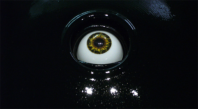
Opto-Isolator (2007) with Greg Baltus
"What if artworks could know how we were looking at them? And, given this knowledge, how might they respond to us?"
The Opto-Isolator is an interactive sculpture of a mechatronic blinking eye at human scale. The eye responds to the gaze of visitors with a variety of psychosocial eye-contact behaviors. It can look viewers directly in the eye, appear to study the viewer's face, look away as if it has stared for too long and it blinks precisely one second after the viewer blinks.
A lot of Golan Levin's work is interactive and requires the viewer to perform some action in order to create and see the digital images. The Opto-Isolator is similar in that the eye needs a viewer to lock eyes with and recognize that the eye seems to be staring back. It is different because it turns the viewer into the viewed, the artwork is actually looking back at us and is aware of our presence. The psychosocial eye-contact behaviors such as blinking and stariing give the mechatronic eye human traits. We have emotions and feelings that trigger these behaviors and the act of making eye contact with another person can also trigger all kinds of other emotions. The Opto-Isolator seems to have these same emotions because we can look it in the eye, which is something we do to figure out how someone is feeling or if they are sincere. We communicate with our eyes and so it is as if viewers are communicating with the mechatronic eye. If artworks knew we were looking at them, I imagine they would respond with something like, "Why are you staring at me?" When the Opto-Isolator feels it has stared at us for too long, it can look away and make us think "Why is that eye staring at me?"

Eyecode (2007)
(Levin has many more works which do not use eyes as the main piece, but involve other interactions such as stomping and talking, but I find these two works about eyes to be particulary fascinating.)
"Eyecode is an interactive installation whose display is wholly constructed from its own history of being viewed. By means of a hidden camera, the system records and replays brief video clips of its viewers' eyes. Each clip is articulated by the duration between two of the viewer's blinks. The unnerving result is a typographic tapestry of recursive observation."
This reminds me of the first artist I looked at, Ken Goldberg, and his project, Demonstrate, because it also films people and places them in the roles of the observer and the observed. In Demonstrate, the roles are fulfilled by different people in different places - observed in the plaza and observers on the internet. Eyecode films the observer and turns him or her into the observed. Demonstrate allows people to come and go in and out of the view of the camera, but Eyecode keeps the person there even after they have left. The viewer's eyes become part of the artwork and in just looking at Eyecode, someone can contribute to the artwork's change and display. It appears as if the many pairs of eyes on the wall are looking back at the viewer, but in fact they are looking at the artwork itself. So, when you look at this, you are looking at the eyes of people who are looking at the eyes of other people who were looking at the wall of eyes...
Source: http://www.flong.com/
Monday, March 9, 2009
Letter Selection G M E
I chose the letters G and M because they are my initials and since my first and last names both start with G, I chose E because it is the last letter of my first name.
As I was researching, I looked up the history of alphabets and was particularly interested in the Egyptian heiroglyphic alphabet. The three letters I selected are all found as heiroglyphs, but since the Egyptian alphabet is phonetic the different sounds of the letters as we use them today are represented by different symbols. M was represented as an owl or a wavy line. Hard G was a pot stand and soft G was a swimming serpent. Short E was a vulture and long E was two reed leaves.
Some interesting stories about the letters:
G - The Phoenicians, and the other Semitic peoples of Syria, used a simple graphic form that looks like an upside down V. The symbol was named gimel, which was the Phoenician word for camel possibly because the upside down V looked like the hump of a camel.
E - The hieroglyph evolved into the Phoenician letter called “hé,” which roughly represented the sound of our H. The Greeks could not pronounce the first sound of the letter name so they dropped this part of the name and the Phoenician ‘hé’ became E.
http://www.studioarts.net/calligraphy/c2.htm
http://www.fonts.com/AboutFonts/Articles/Letterseries/LetterM.htm
Sunday, January 25, 2009
Artist Presentation 1: Ken Goldberg

Ken Goldberg's work questions our trust in what we see on the internet. It is what he calls "telepistemology," or the study of the nature of knowledge gained through remote, mediated sources such as the internet. In his work, Telegarden (1995), he gives people a chance to take care of living plants through the internet by operating a robotic arm. From their home computers, people can register as community members to care for the plants. Goldberg wants users to have doubts about whether the plants and the robotic arm are real and he says, "media technology generally facilitates the suspension of disbelief. I'm trying to facilitate the resumption of disbelief."
This project reminds me of the work of landscape artist such as Andy Goldsworthy, who goes out into nature and creates whole pieces of art just from what is available outside. Goldberg has taken nature and put it into a kind of scientific frame where it can be cared for by people electronically whereas Goldsworthy leaves his work where he created it, letting it be destroyed naturally and he only keeps it in the form of photographs.
In Demonstrate (2004), Goldberg uses a telerobotic surveillance camera placed above Sproul Plaza at U.C. Berkeley. On the Demonstrate website, users can control the cameras to focus on or zoom in on people in the plaza and post text about the images. The plaza was the site of anti-war demonstrations and a launching pad for the Free Speech Movement in the '60s and this work was created in honor of the 40th anniversary of the Free Speech Movement. It raises questions about freedom and privacy in public places in a time when technology is regularly used to capture our images without our permission.
Today, we can be captured several times a day on security cameras as we walk by or in buildings. The government, companies or other places use these cameras to protect themselves. In this project, Goldberg has put regular people as opposed to building security, behind the cameras. The people in the plaza are being watched and spyed on by regular people just like them. This makes me wonder how those people would feel if they knew they were being watched. When we walk by a security camera, we don't really think anything of it. We don't have to worry that we are being watched because we are not doing anything wrong and we don't really think about anyone behind the camera. The camera is watching us, not people. However, if we know that other people can see us we will be more self-aware because we are thinking about how they are percieving or judging us.
Wednesday, January 21, 2009

Subscribe to:
Posts (Atom)