My map of St. Mary's is related to a research proposal that I wrote for one of my Anthropology classes. The proposal is about the cigarette smoking behaviors of St. Mary's College students. I want to find out why students begin to smoke and what influences their smoking behaviors.
For the map, I decided to do some research about my own smoking behavior and identify places on campus where I take smoke breaks. I made bars with pictures of smoke around them in Google Sketch. They represent the amount of stress I feel before I smoke a cigarette. At each place, I wrote about what I see, if I am with anyone else, and what I am doing when I decide to take a smoke break. The place markers are color coded according to how often I smoke at each place: red means everyday, purple means four to six days and blue means one to three days. The paths are color coded the same way, but with different shades of each color to distinguish the paths from each other. I also included some nonsmoking areas with reasons for me to quit smoking. One is at the cross country meeting place and one is at my house in Baltimore. I would have liked to includ pictures at each place to show when I am alone and when I am with friends and what I see when I am smoking a cigarette.
By looking at the map and reading about each place, you can draw some conclusions about my smoking behaviors. I am more stresses out when I smoke alone and when I am doing schoolwork. I smoke more often at places that I smoke alone rather than when I am with friends.
Showing posts with label projects. Show all posts
Showing posts with label projects. Show all posts
Thursday, May 14, 2009
Google Sketch Monuments
For the monuments, I chose three of my favorite places on campus, the cross country meeting place by the track, the Monty porch and a spot in Historic St. Mary's that is a nice place to watch the sunset. I tried to make the design of the monuments reflect the reasons I like to go to these places.
The cross country club meets at the end of the south crescents next to the track. We meet here to start our warm up run to Historic. The monument is in the shape of the mile markers along the paths in the woods of Historic. The writing symbolizes the new varsity cross country team that will start in the fall.
The Monty porch monument looks like a mini version of the porch with the same textures and colors. It also has a chimney because I like to take smoke breaks on the porch when I am working in Monty.
In Historic there is a bench under a tree next to the graveyard that I like to sit in and watch the sunset. The monument has the colors of the sunset and they are transparent so when you move around it the colors change. The bench reflects the setting of the spot.
Wednesday, May 13, 2009
Carrara Rendering
I think Carrara was the most difficult program to use that we have learned in this class, but I had fun making the map of my home neighborhood. I added some things to mark where we used to go and to symbolize what we would do. The map is based on the parks around my house that we would go to. I added a sleigh to one of them because we used to sled down the big hill at the park and at another park, I added a swing set because there is a swing set at that park that we used to play on. At the end of my street, I added a bike because we were allowed to ride our bikes to the stop sign there and then we had to turn around and go home. I put a 3-D house overtop my house to make it stand out more.
Friday, April 17, 2009
A to Z Critique Response
A lot of the posters were really impressive like the McDonalds spoof poster. The graphics looked really well done and the concept was also very ineresting.
For my posters, I tried to work with the symmetry of my initials GMG to find the image in the animals that represent the letters in the Egyptian heiroglyphic alphabet. In the owl poster, the owl is the heiroglyph for M and the owl's face reflects the symmery of the initials. I darkened the outline of the owl's eyes and made them more of a G shape to stand out from the face and I darkened the M shaped line that goes across the owl's face to make the M stand out. I also tried to make the shadowing and feathers on both sides of the face look more similar to each other to get more symmetry.
I don't think the snake poster turned out as well because the letter concept does not stand out as much. The waves of the water are supposed to represent the M which was sometimes represented in the heiroglyphic alphabet as a wavy line. I tried to emphasize this by making the waves more wavy and adding a wavy line between the snake heads. The snake represented a G in heiroglyphs, so I used the snake and the snake reflection to create symmetry on the poster. I wanted the shape of the snake head to look like a sideways G and I added a little G next to the reflection to emphasize it.
Friday, March 13, 2009
Letter Presentation Response

After the critique, I have decided to go with the symmetry idea and use GMG instead of E and I still want to do something with animals or nature. I like the idea of using the owl as a structure for the symmetry of my initials GMG, but I am still thinking about how to make it into a poster using the letters.
Journey Critique Response
I agree that the rollovers on my first page could have had better images on them or they could have been invisible so that the viewer had to figure out what I was looking at in the picture.
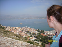
I don't think I would have liked to have text on the journey pages because I was trying to convey the sense that these journeys were taking place over the course of a day. On the real journey in Greece, I put the pictures in the order that they were taken, so the natural lighting of the pictures changes. On the imaginary journey I found pictures that showed Easter Island at different times of the day - from daytime to sunset to nighttime with a picture of the moon in it. For both journeys it is as if I am a tourist taking a day trip to each of these places and I want the viewer to feel the same way.
I don't think I would have liked to have text on the journey pages because I was trying to convey the sense that these journeys were taking place over the course of a day. On the real journey in Greece, I put the pictures in the order that they were taken, so the natural lighting of the pictures changes. On the imaginary journey I found pictures that showed Easter Island at different times of the day - from daytime to sunset to nighttime with a picture of the moon in it. For both journeys it is as if I am a tourist taking a day trip to each of these places and I want the viewer to feel the same way.
Monday, March 9, 2009
Letter Selection G M E
I chose the letters G and M because they are my initials and since my first and last names both start with G, I chose E because it is the last letter of my first name.
As I was researching, I looked up the history of alphabets and was particularly interested in the Egyptian heiroglyphic alphabet. The three letters I selected are all found as heiroglyphs, but since the Egyptian alphabet is phonetic the different sounds of the letters as we use them today are represented by different symbols. M was represented as an owl or a wavy line. Hard G was a pot stand and soft G was a swimming serpent. Short E was a vulture and long E was two reed leaves.
Some interesting stories about the letters:
G - The Phoenicians, and the other Semitic peoples of Syria, used a simple graphic form that looks like an upside down V. The symbol was named gimel, which was the Phoenician word for camel possibly because the upside down V looked like the hump of a camel.
E - The hieroglyph evolved into the Phoenician letter called “hé,” which roughly represented the sound of our H. The Greeks could not pronounce the first sound of the letter name so they dropped this part of the name and the Phoenician ‘hé’ became E.
http://www.studioarts.net/calligraphy/c2.htm
http://www.fonts.com/AboutFonts/Articles/Letterseries/LetterM.htm
Subscribe to:
Posts (Atom)